


Challenge
The theme of the Test Assignment was a Balanced Diet Mobile Application. As I found out later, this assignment was based on a real client project that Mobi Lab had a few years back.
I was amazed by the test assignment. It consisted of a well-defined goal, background, process flow, user scenario and three creative tasks. The content was well-thought-out and the brief was also visually attractive.
Moreover, it was one of the best briefs that I had ever received.
The assignment consisted of 3 creative tasks:
- User profile
- Sketching the key flows of the application
- Visual design for 2-3 app views
Creative Tasks
1 - User profile
Create an imaginary user profile for Jane
Emphasizing with Jane was quite easy because I could find some of her problems in myself and my friends. Who wouldn’t want someone to tell them that it’s okay to eat that extra piece of cake?
I started off with Jane’s pain points and challenges – what are the problems that Jane is facing right now? And why?
Next, I shifted to her needs and wants – what might be the core reasons why she would use this application?
As I was completing the persona page, I tried to describe Jane as if she was my friend, not a made-up character.
“Make sure each persona is specific and realistic: avoid exaggerated caricatures, and include enough detail to help you find real-life representation.”
Ravel L. Veal ,“How to Define a User Persona”
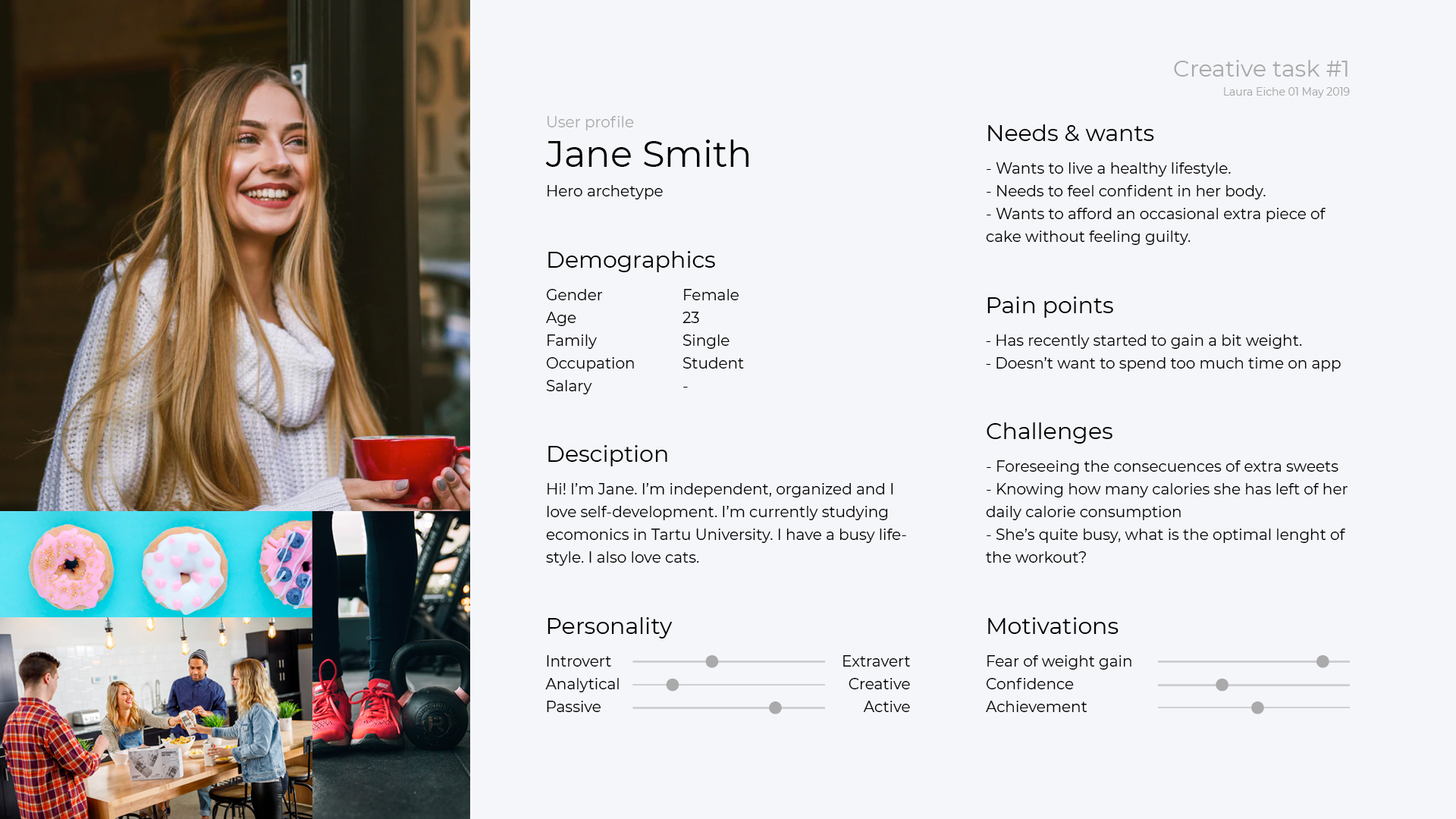
Mobi Lab UX/UI Design Internship Test Assignment – Creative Task #1 – User Profile
2 - Key flows
Sketch out the key flow(s) of the application.
The second part of the test assignment was the most difficult for me. Mostly because I had never created wireframes before.
Looking back now, I can honestly say that I focused too much on the looks.
I started out with pen and paper and creating wireframes from scratch seemed much easier than it actually was. However, moving to my iPad gave me a new level of freedom. IPad allowed me to be less critical with my pen strokes because I could easily tweak everything later.
Codemagic Developer Personality Test – Drawing process
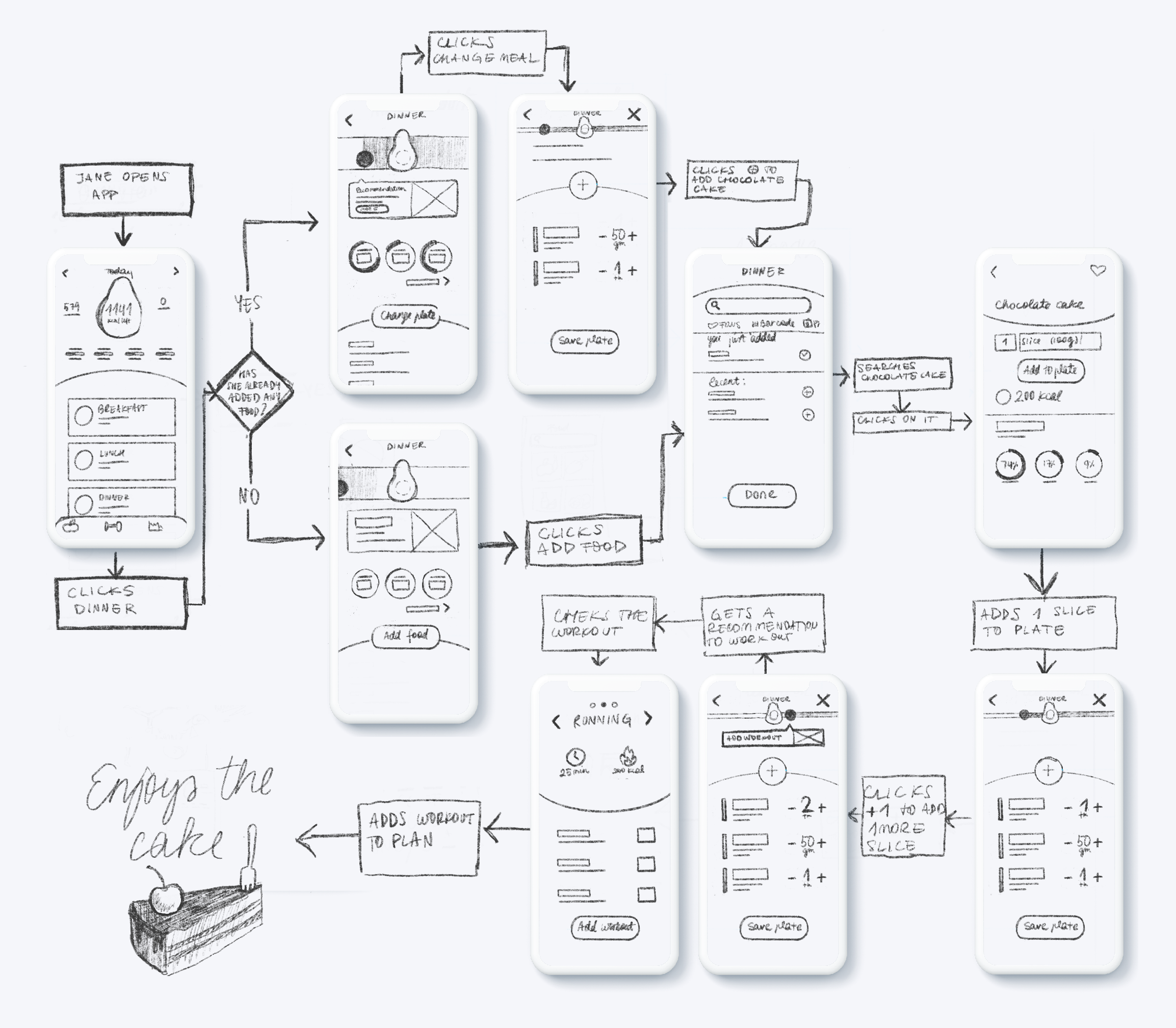
Mobi Lab UX/UI Design Internship Test Assignment – Creative Task #2 – Sketching the flow
3 - App views
Create a visual design for two or three main app views.
I enjoyed this part the most. I downloaded 15 different diet and food-related apps and wrote their best and worst parts down. Based on my small research, I started sketching down some ideas for the app.
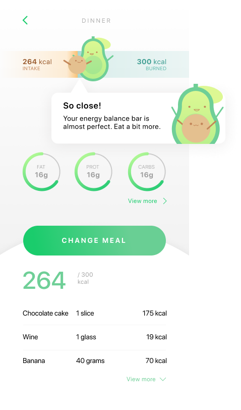
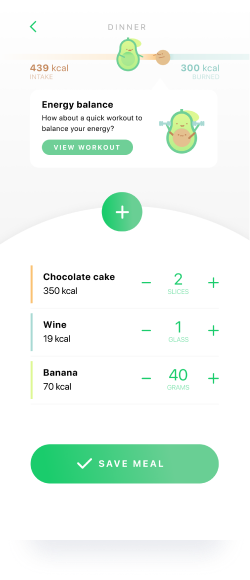
The concept for the application is balance.
For me, healthy eating and living is about balance. Calorie intake and burned calories need to be balanced, as do the percentages of fats, sugar and protein in the diet. So as I was playing around with the idea of balance (sketching scales, gravity, forces), the idea of a balance bar came into my head.
One misshaped circle reminded me of an avocado. As I started playing with the idea of an avocado in my app, I came upon a solution. Avocado Balance Bar – having a mommy avocado and a child seed be the motivators to keep your diet in balance.
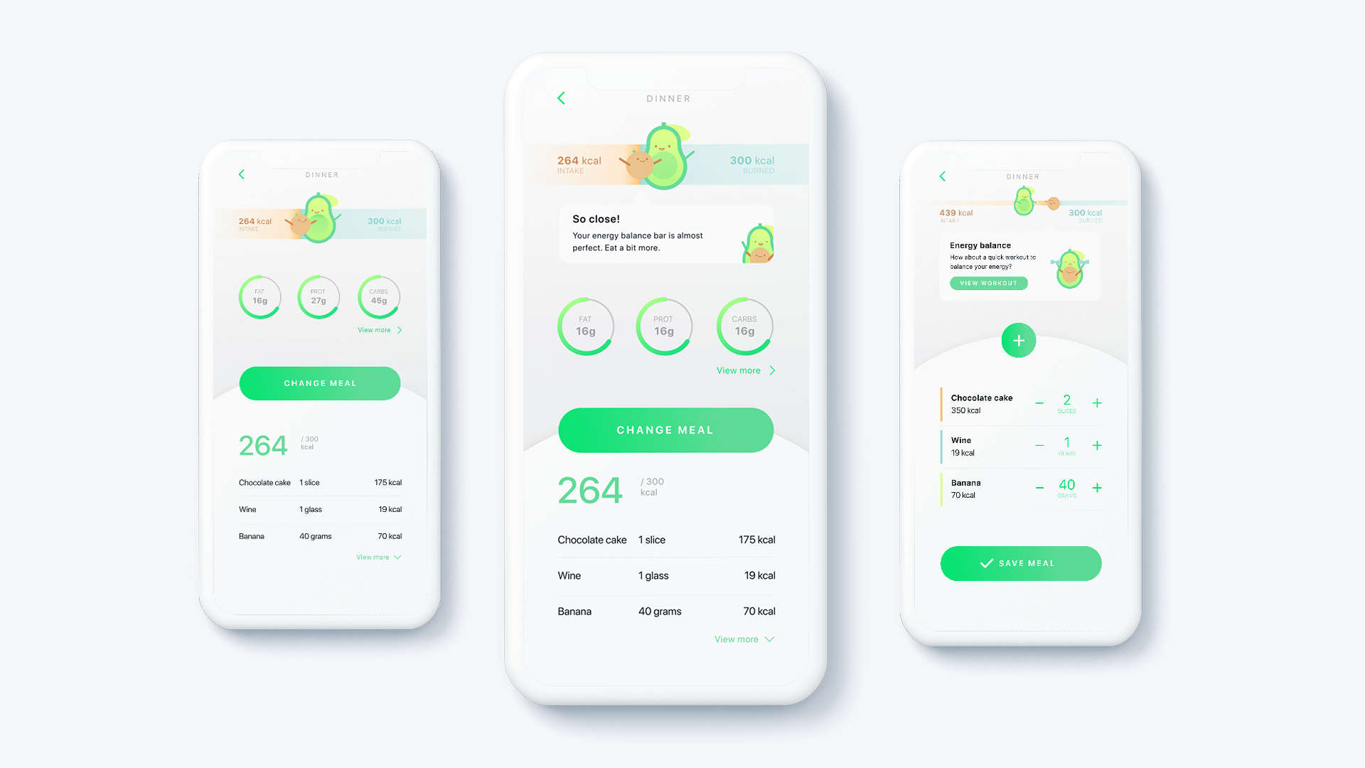
Mobi Lab UX/UI Design Internship Test Assignment – Creative Task #3 – 2-3 App views
Feedback
Mobi Lab was pleased with my solutions. Above all, they liked the way I had presented my #2 task and the Avocado Balance Bar idea.
I am happy to share some of the suggestions that Mobi Lab’s Lead UX/UI designer Elmo gave me.
- Always colour-test the application. When choosing my colours, I didn’t have accessibility in mind.
- When showing the navigation on a wireframe, draw the arrows from the button, if it is the action trigger. I drew them from frame to frame.