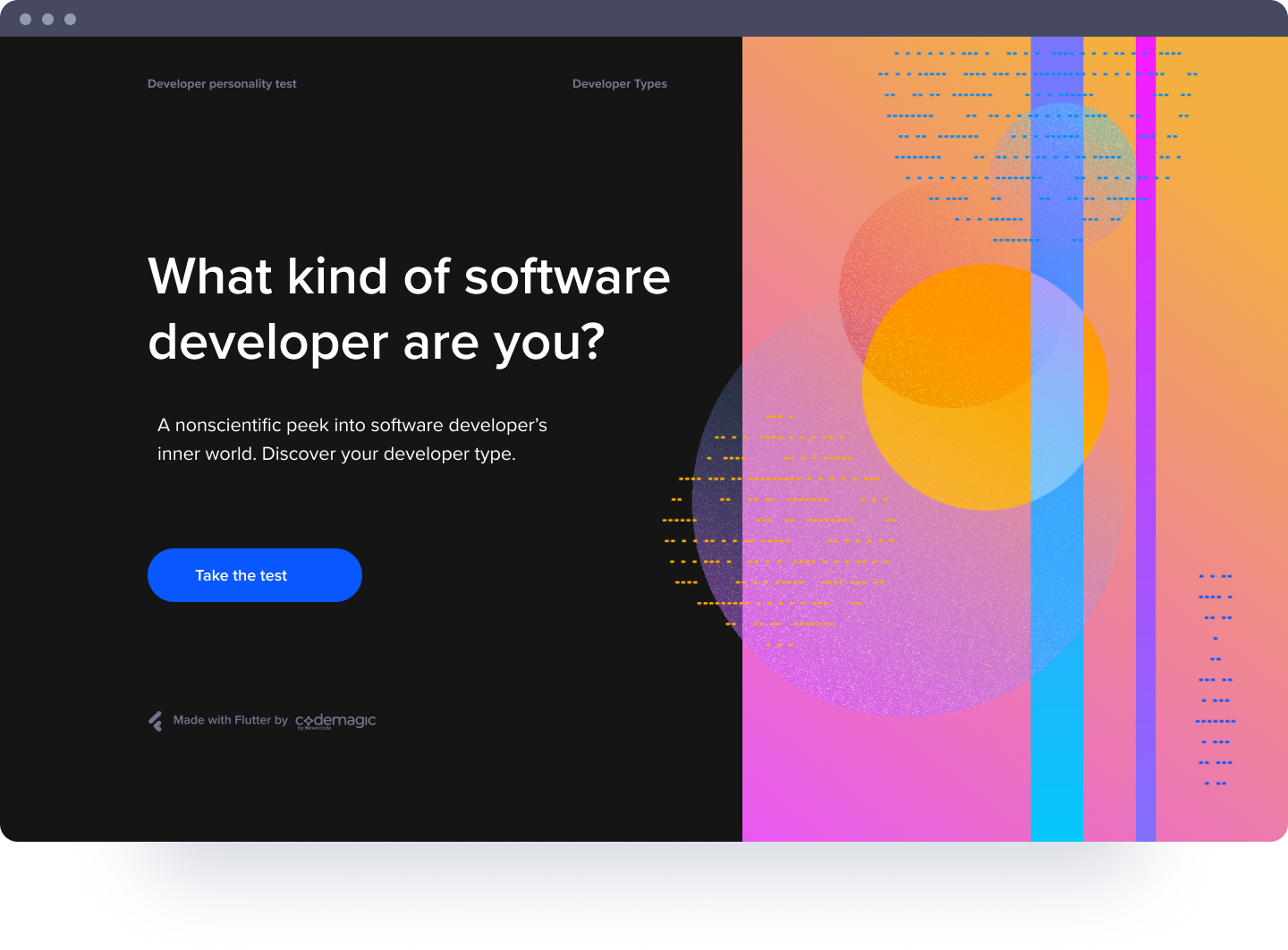
I The design task overview
Task I - Design and explain
Create 2 screens of a chat web app. One for a mobile device and another for desktop. The app is for Space Agency like NASA, SpaceX and Blue Origin
Task II - How to proceed
A paragraph or two describing very shortly the steps/processes that would be necessary to improve the chat webapp. (testing, wireframing, analysing etc)
II Why would the space agencies need an internal web chat app?
First up, I kept asking WHY? It didn't make sense, why would a space agency need an internal web chat app, when there are a lot of very good alternatives like Slack or Fleep?
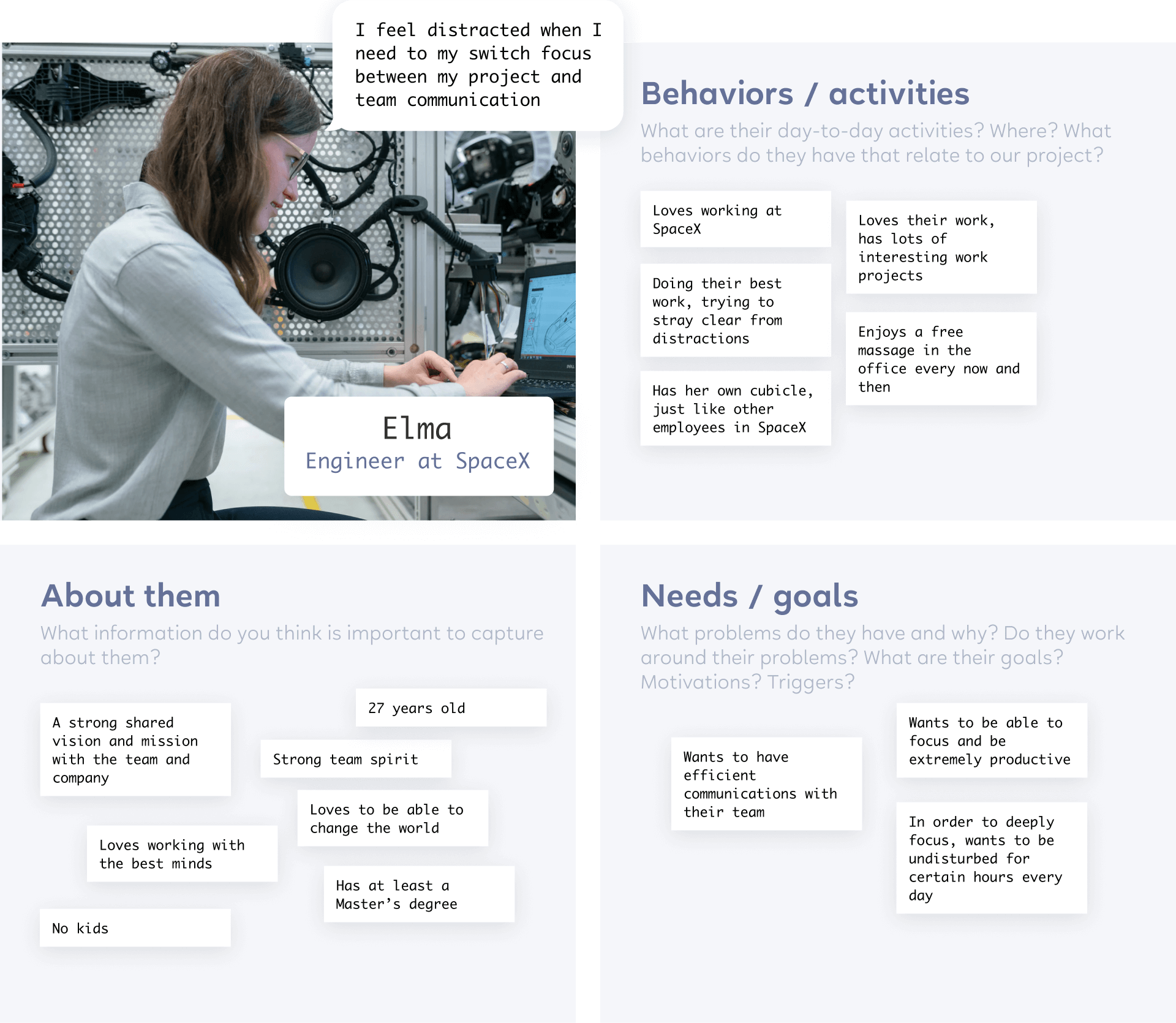
So to dig into the problem and build empathy, I started reading what it's like to work at NASA, SpaceX or Blue Origin.
And created a persona based on different articles.

III Setting up criteria for the app
I decided to put down some criteria for the app, to have a more clearer direction. Having the criteria in my mind at all times made sure that I didn't accidentally shift the focus mid-design. The criteria is based on the previous research.
Professional use only
Exchanging information and thoughts with colleagues and teams
Clean and accurate
Space industry is extremely accurate, so the app needs to be well thought through
Empowering, not distracting
A supporting tool for the best minds in the world to help them push the boundaries and dream the impossible
IV How about the competitors?
The main question for me here, was that WHY wouldn't the space agency use Slack or Fleep or any other already existing communication tool?
So to make more sense, I started looking at the competitors. I read a lot of reviews and articles both about the good, the bad and the ugly of many Web Chat apps.
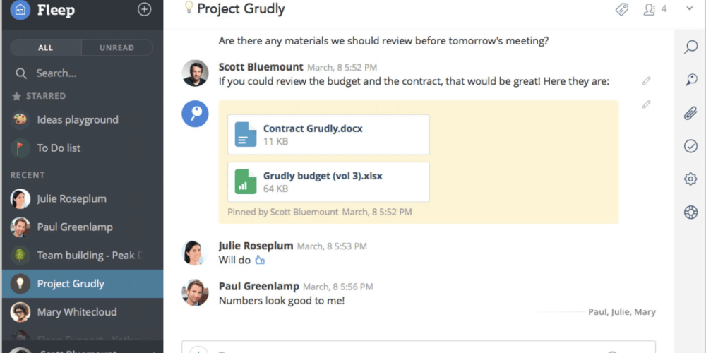
Here, I will highlight only the first two - Slack and Fleep.

Slack
- Powerful search and integrations
- Ability to organise channels
- Detrimental to deep work because of frequent interruptions and context switching
Fleep
- Open network (one account only)
- Complicated to use with teams
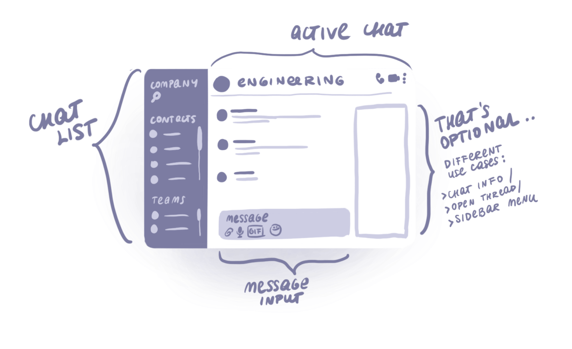
The UX skeleton of a typical Web Chat app
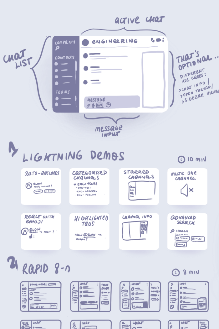
V Sketching the solution based on app criteria
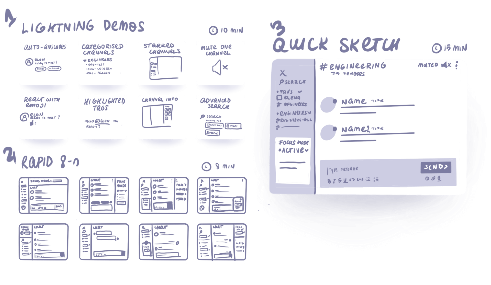
I started my sketching faze with Lightning Demos. I quickly sketched down all the best ideas used in other web chat apps.
Next up, I started sketching the possible layouts. I decided to follow the same typical web chat app layout, because this was an established convention.
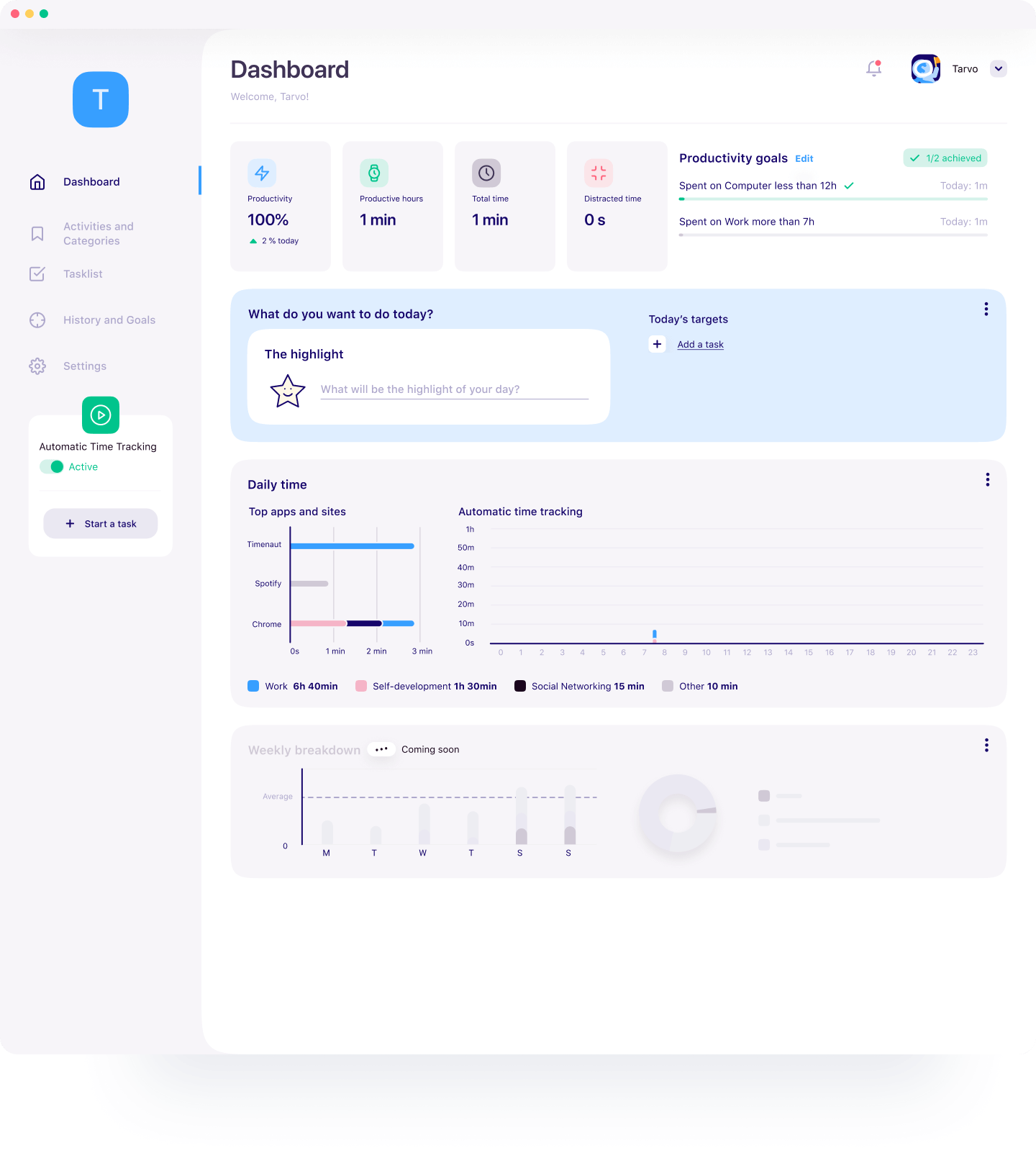
Codemagic Developer Personality Test – building blocks for the characters, first illustrations
VI Making it visual
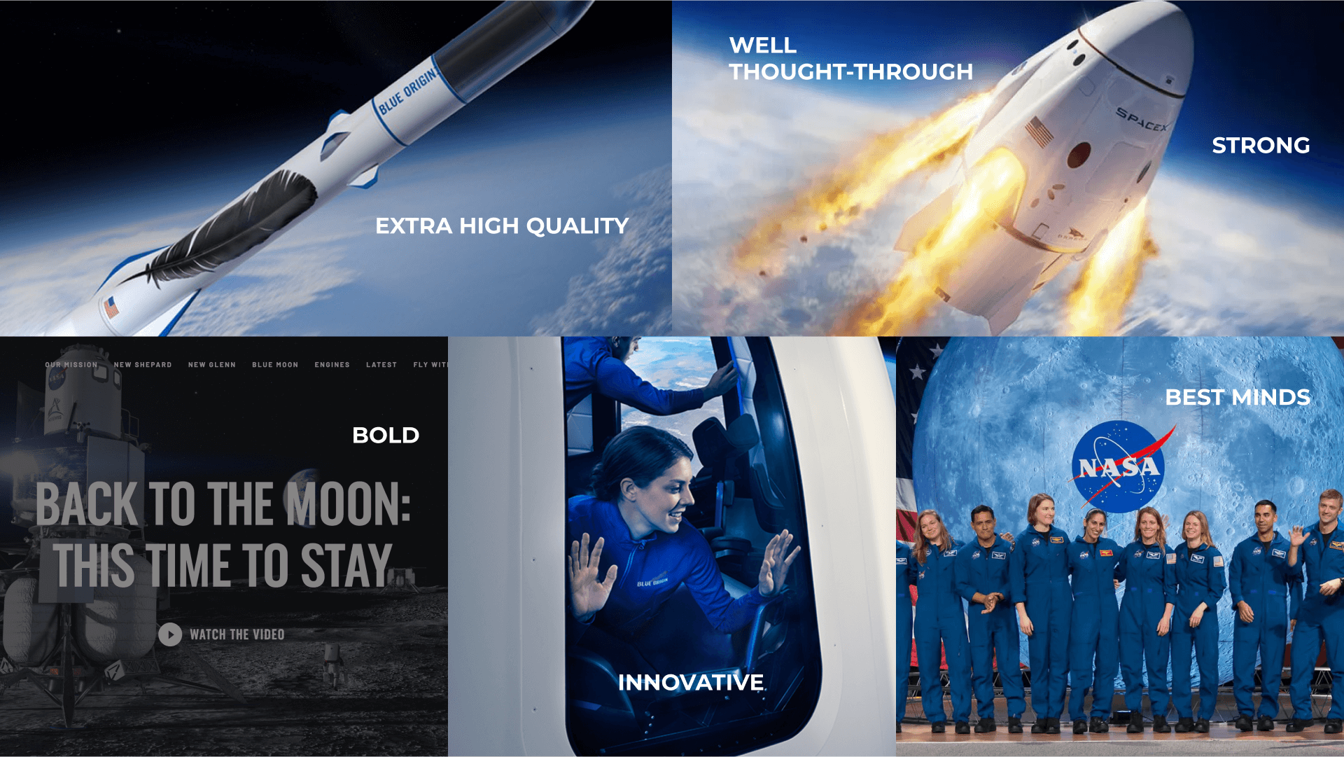
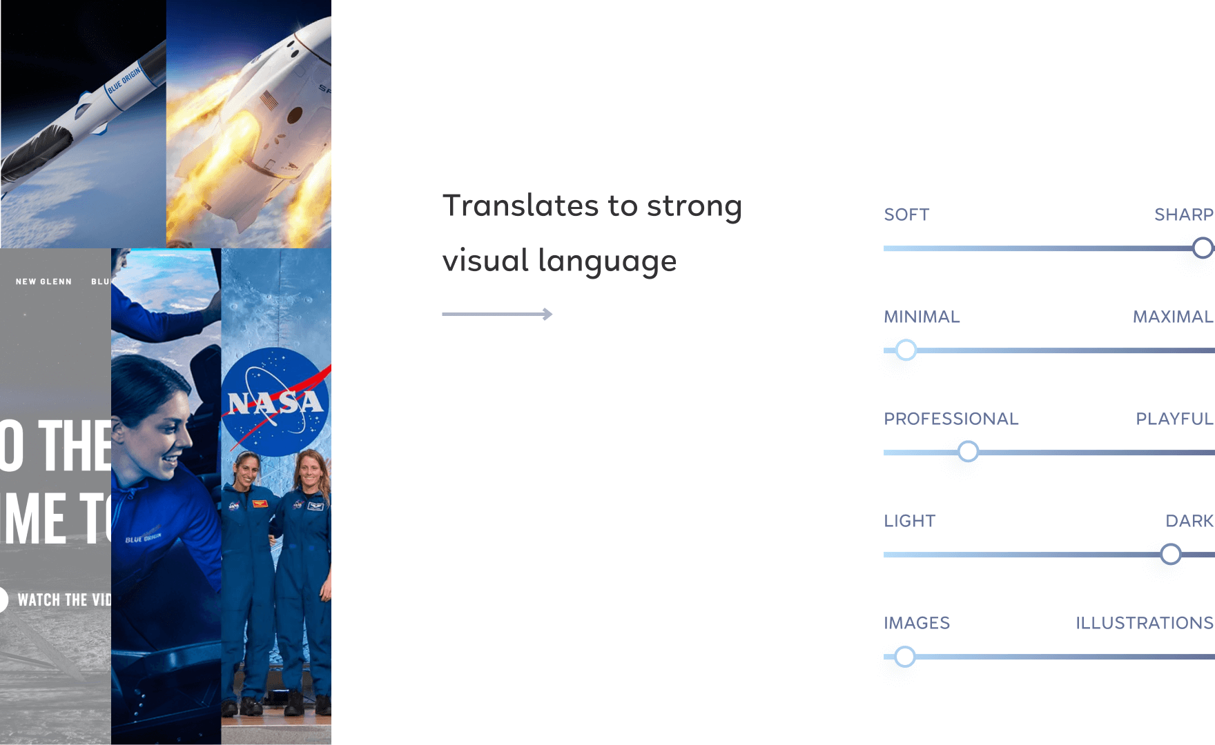
For the visual UI side, I collected visuals from SpaceX, NASA and Blue Origin web sites and put together a mood board.
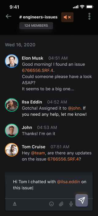
VII Final showcase
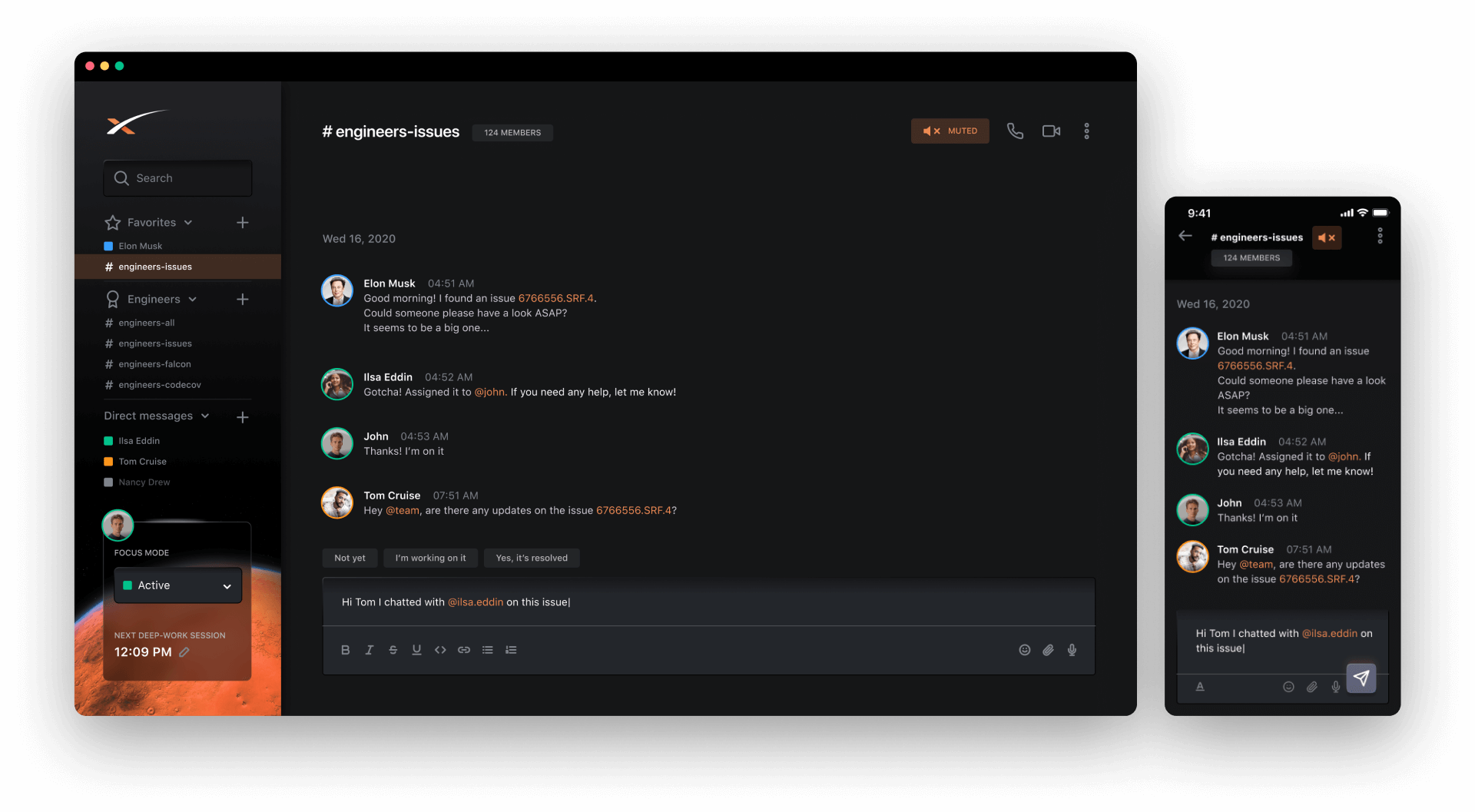
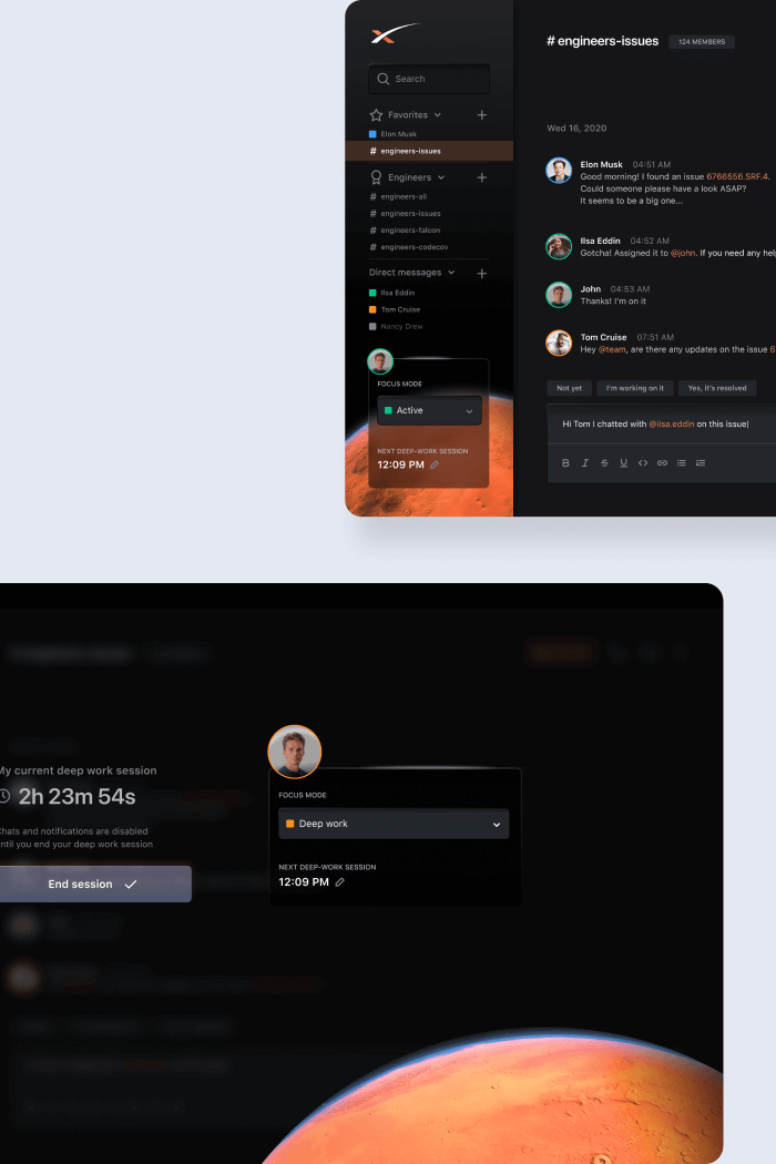
Left-side menu
- Search for apps
- Chat list by categories (favourites, custom category: #engineers, direct messages)
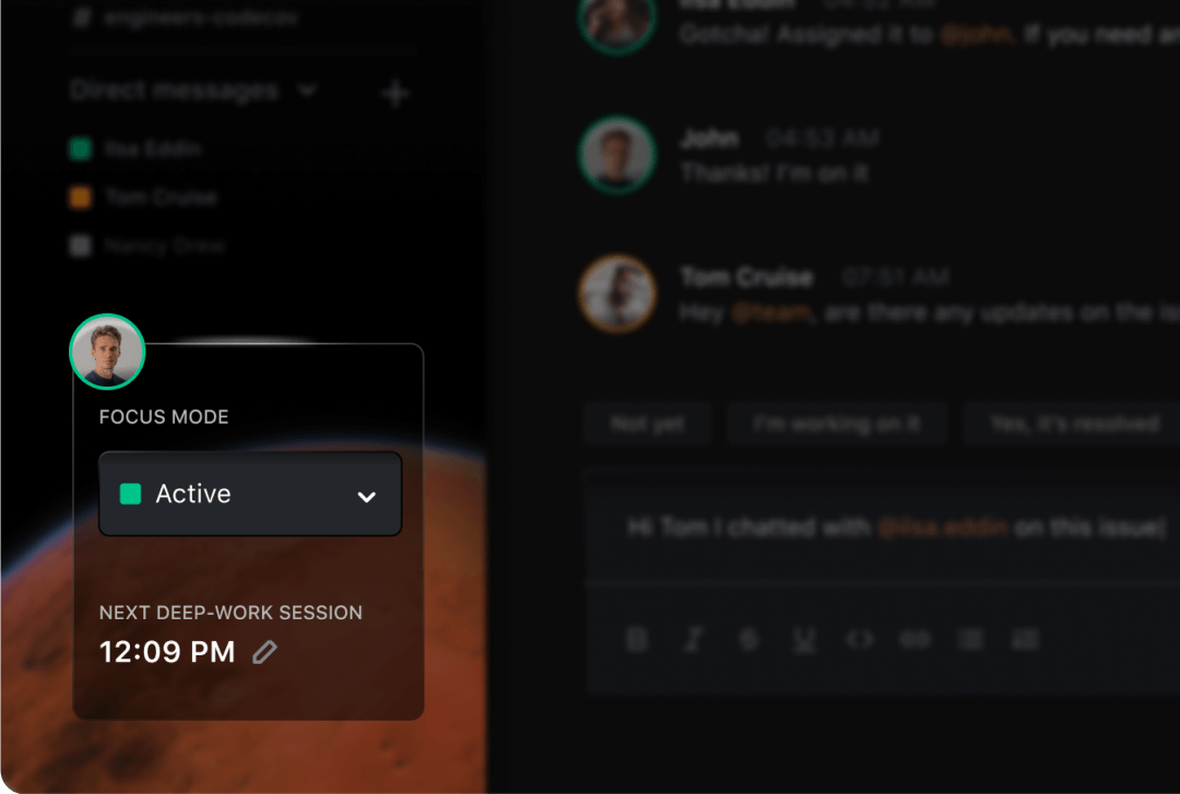
- Focus mode
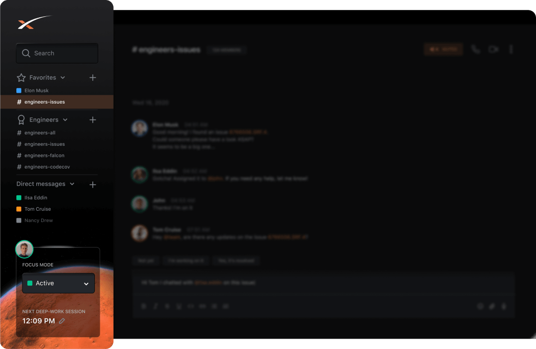
Focus menu
To eliminate distractions and allow the employees to focus on their projects, I introduce the Focus Mode
When focus mode is ACTIVE, the user gets all the notifications and can chat with other team mates.
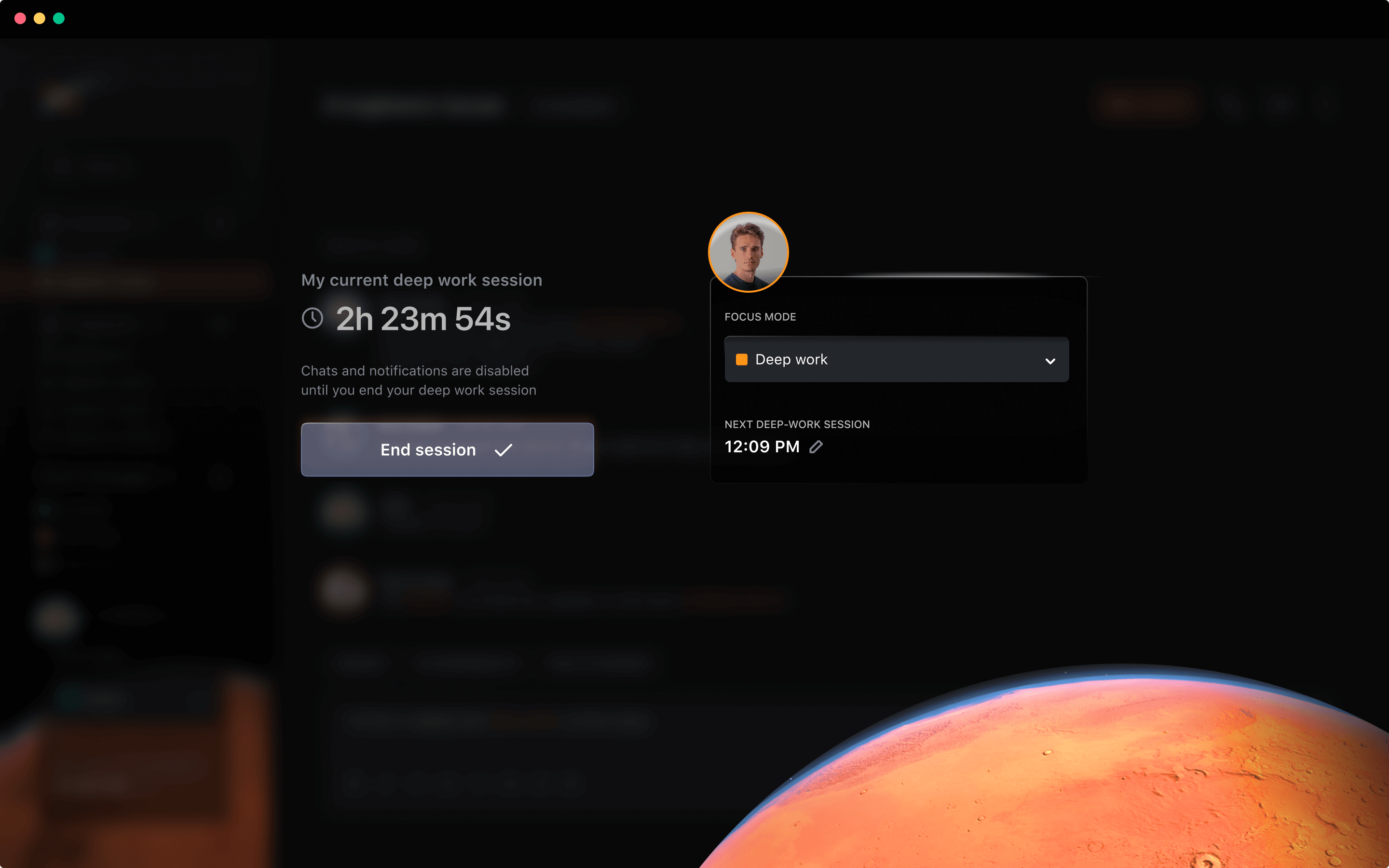
Deep work mode
When Focus mode is set to DEEP WORK, the app UI is disabled.
User won’t get any notifications, and they won’t be able to see what’s happening in the chat.
This blocks the user from constantly checking the chat and enables them to work more productively
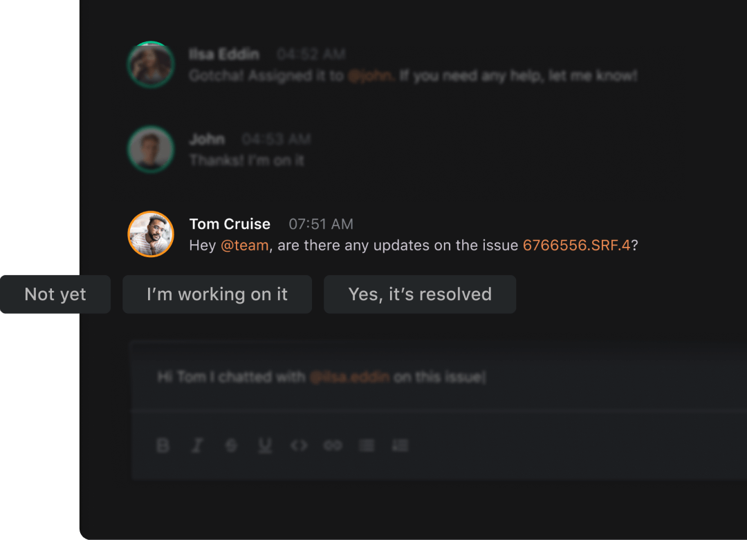
Automatic replies
Speeding the communication up with automatic replies.
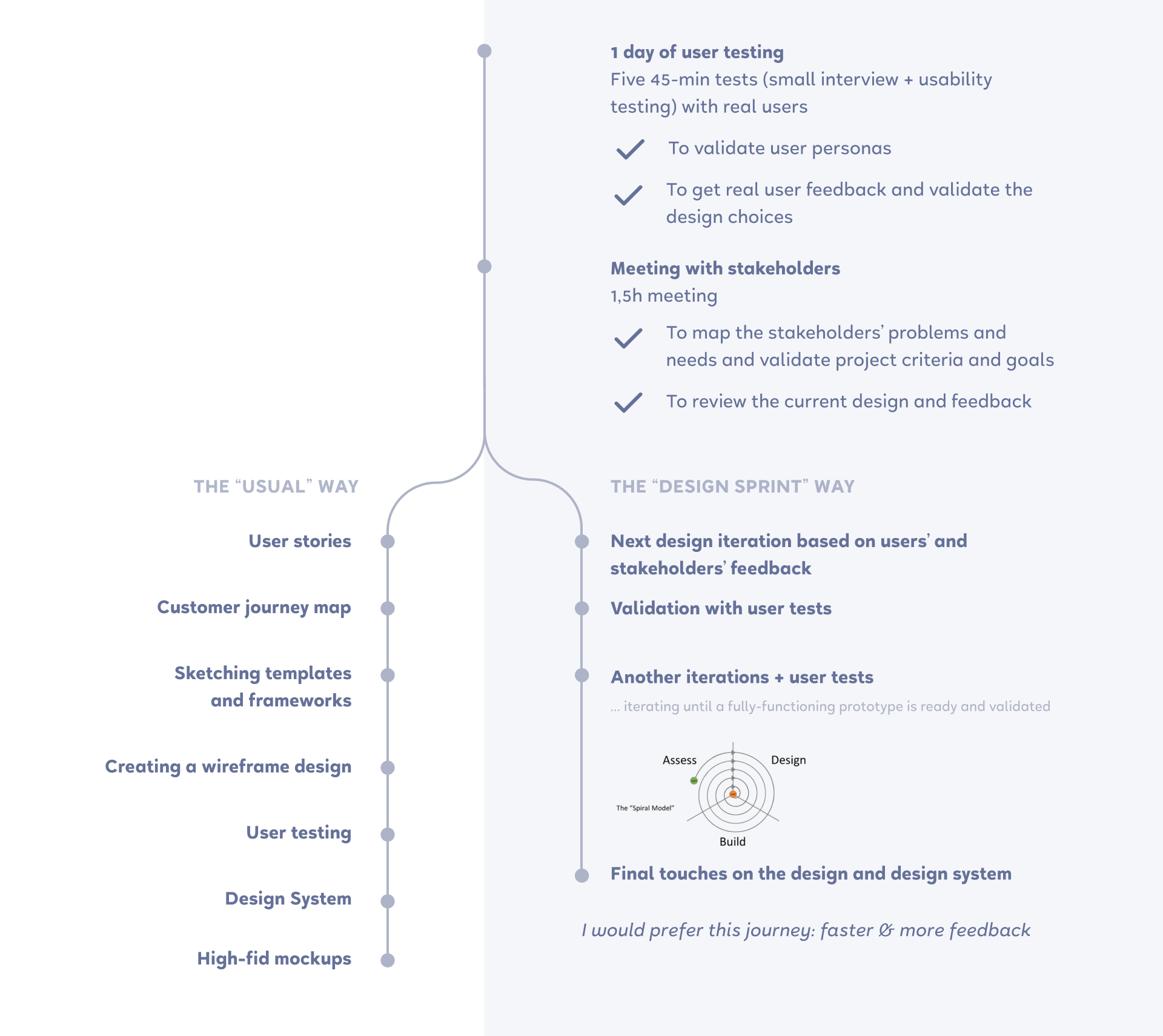
VIII Task II - How to improve the first prototype
Here's a small overview of all the next steps on how to improve the first prototype

IX The final thoughts and reflection
I sent this case study to 2 different companies to apply for a UX/UI Designer position. And both of the places initially offered me a job. 🎉
- Presentation truly is the key. A well-presented design can speak for itself and bring the results better than just a few screens without any context.